TONTON Architecture Atelier
Art Direction
Another Collective
Design
Bruno Soares
Eduardo Rodrigues
Motion Graphics
Lyft Studio
Services
Visual Identity
Branding
Award
Gold — Graphis Design Award
TONTON is an architecture atelier that results from an exercise of space creation and how it makes us feel, how it conditions our life, how it changes our perspective, and our approach in the most mundane circumstances.
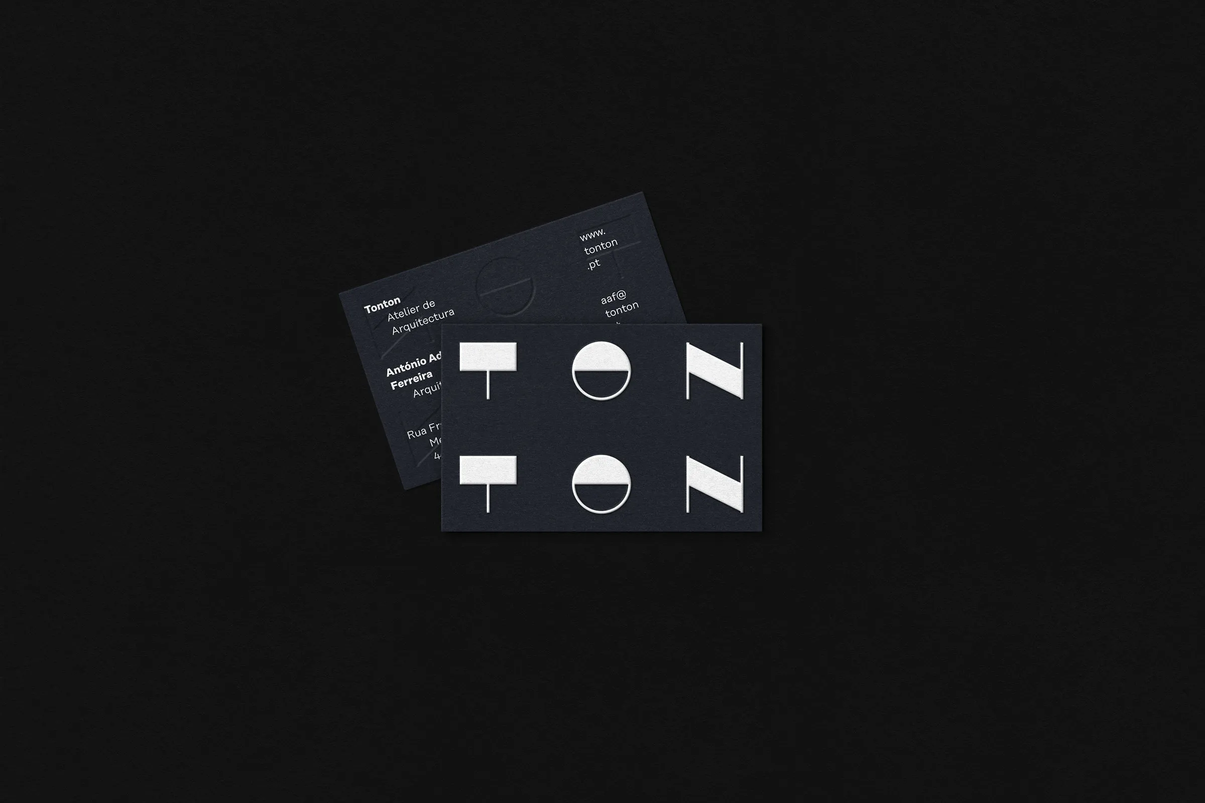
The word TONTON is the result of a repetition. An interjection that arises from a touch, a repetition of words from which we made the real strength of the project. The brand design exercise had precisely that starting point, which resulted in a constant use of the name separately at a graphic level.
In addition to this separation, its use makes use of both the upper and lower part of the graphic space, in a geometric approach, attributing a construction side to the identity, something that also appears in the objects. Thus, the graphic construction made its strength the linguistic repetition that extends to the elements of the brand, represented geometrically through paper as an object.