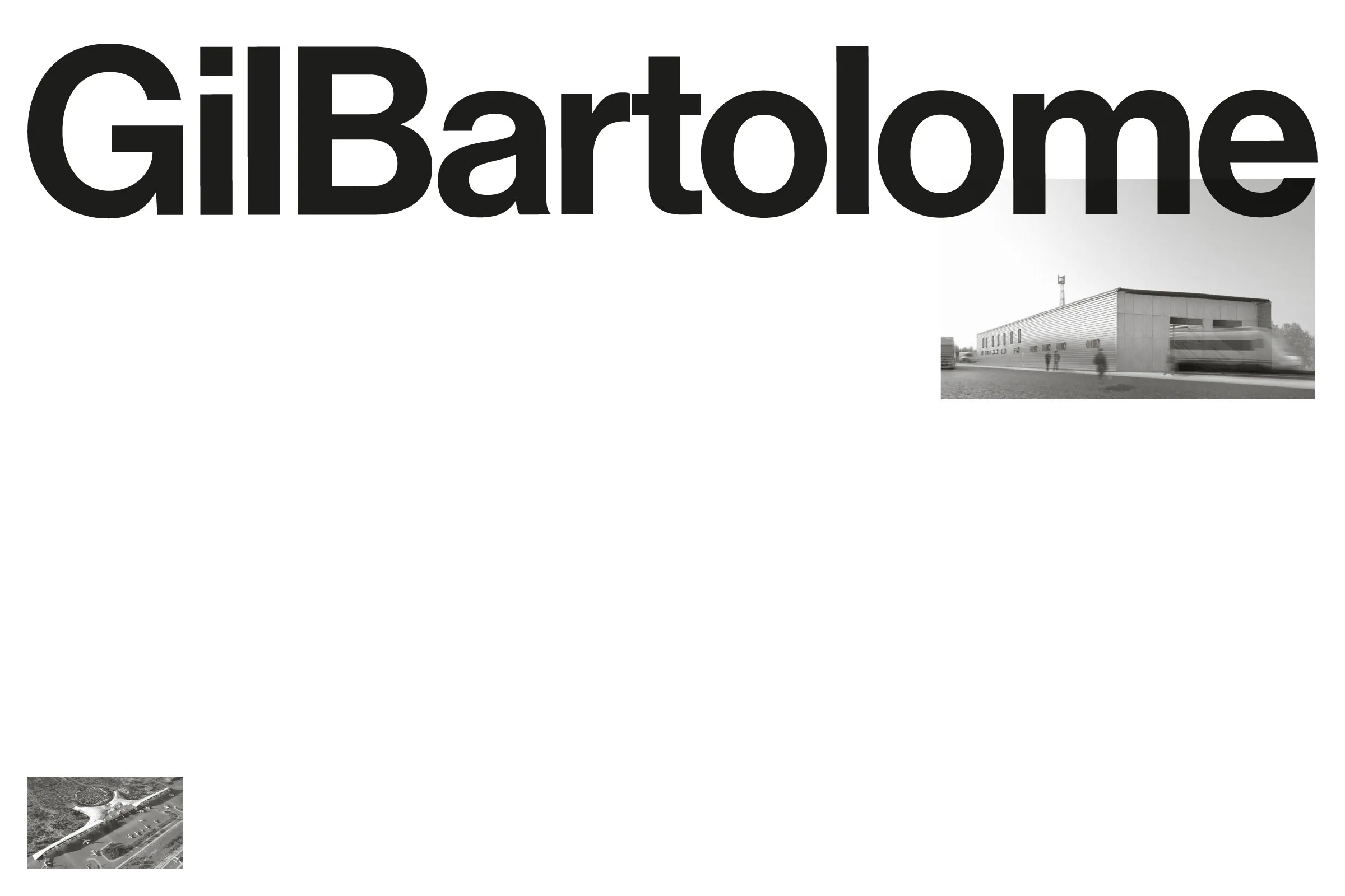


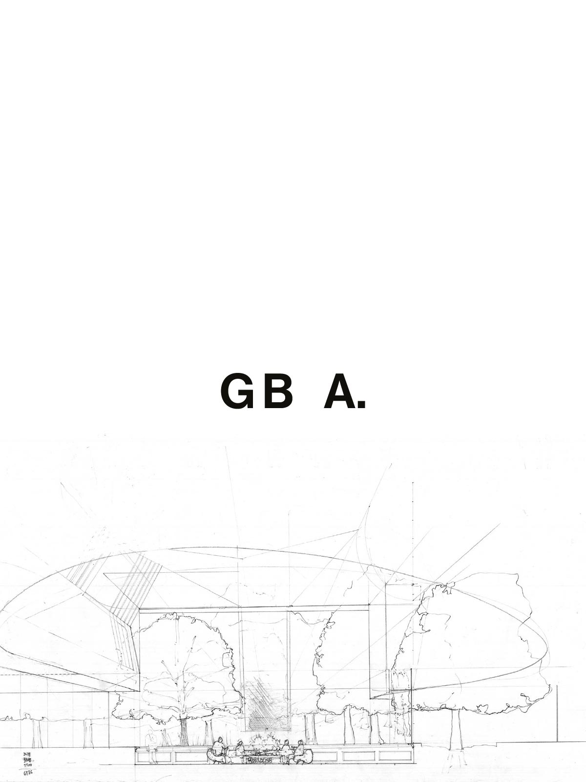


GilBartolome Architects
Creative Direction
Bruno Soares
Eduardo Rodrigues
Design
Eduardo Rodrigues
João Randmer
Web Design
João Jesus
Services
Creative Direction
Visual Identity
Web Design
Client
Gil Bartolome Architects
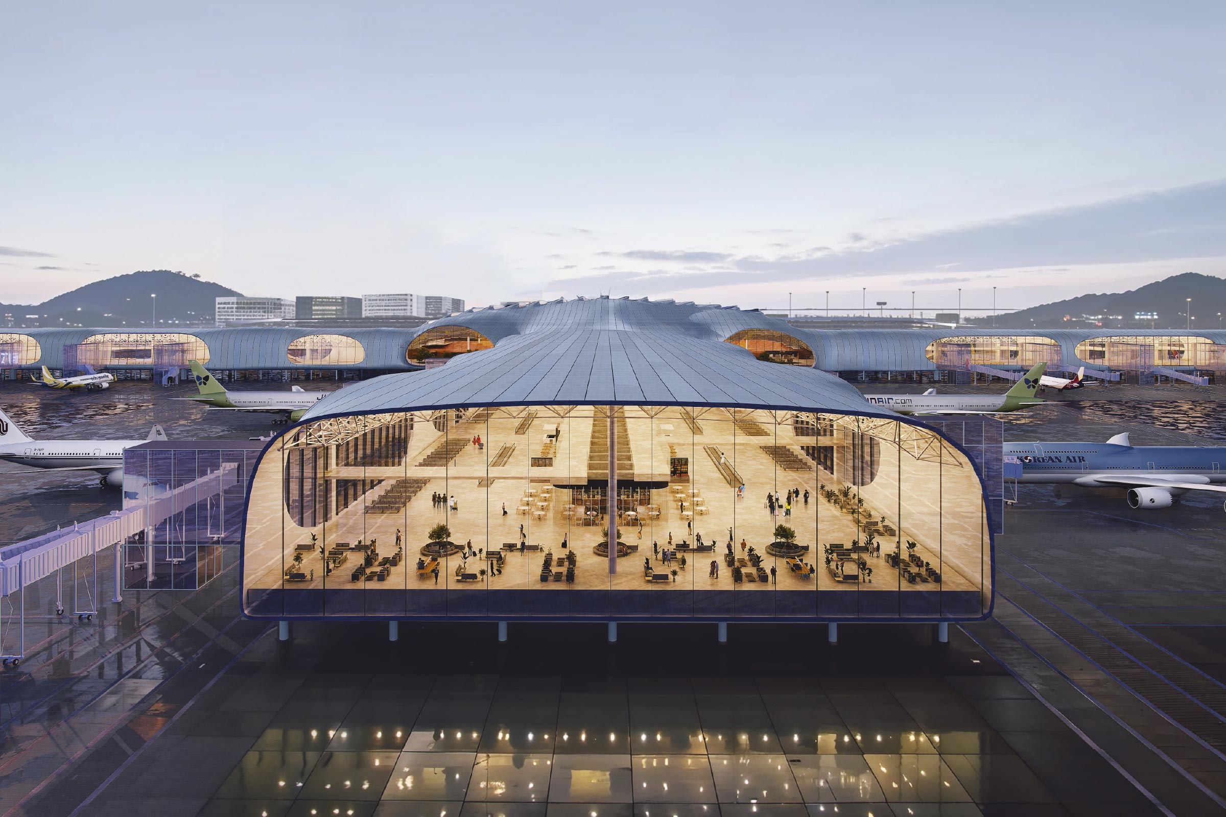
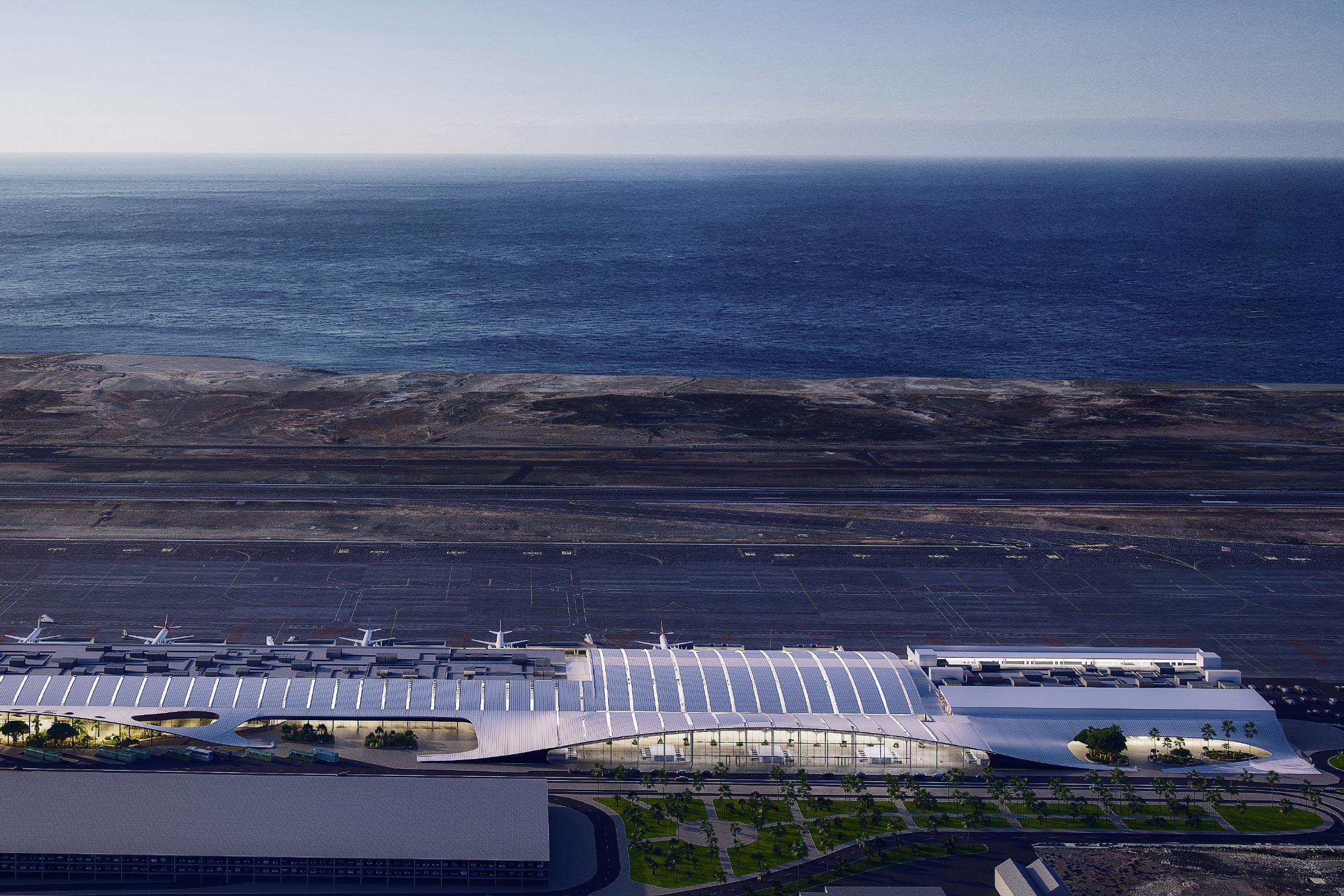
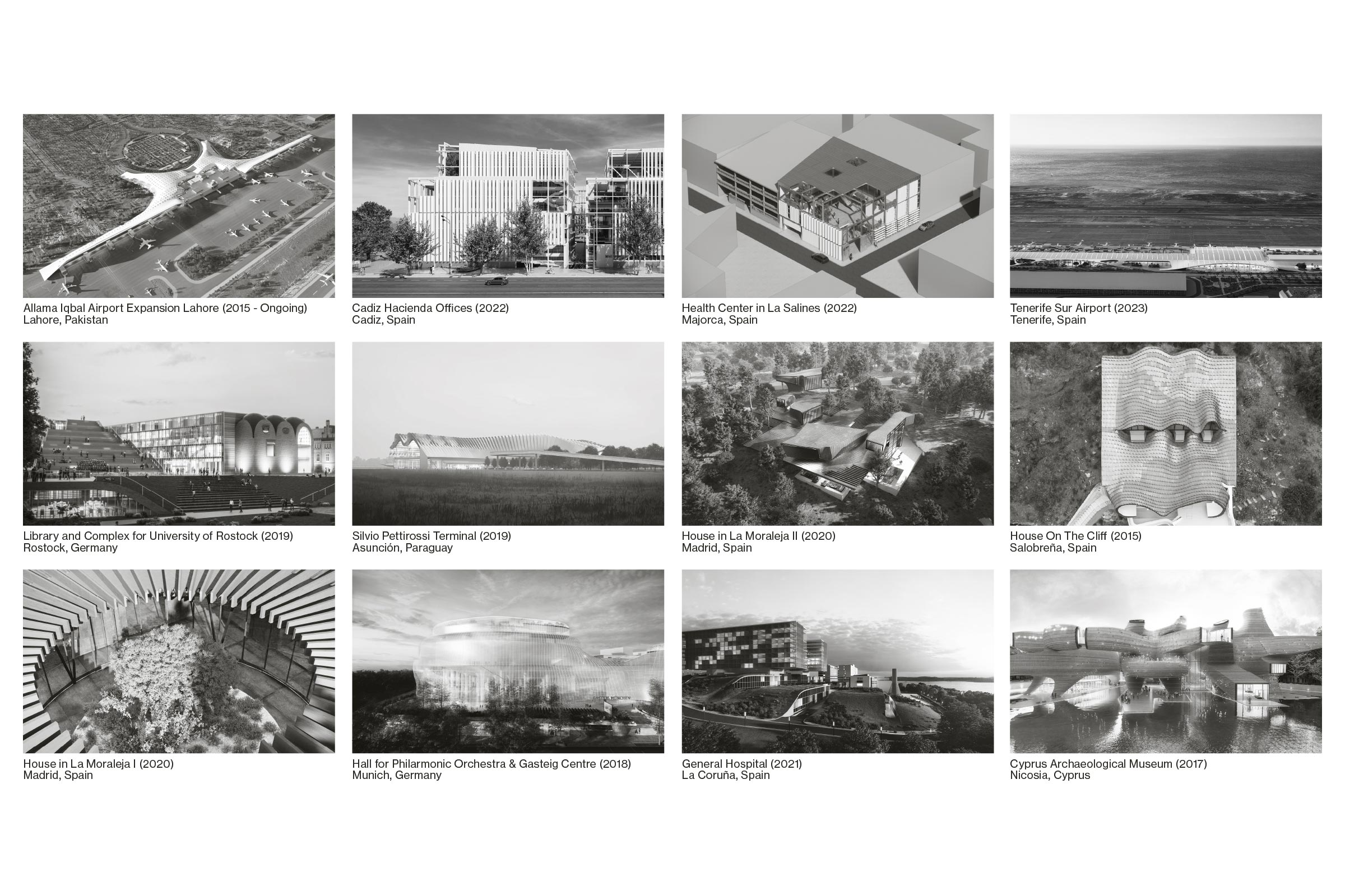
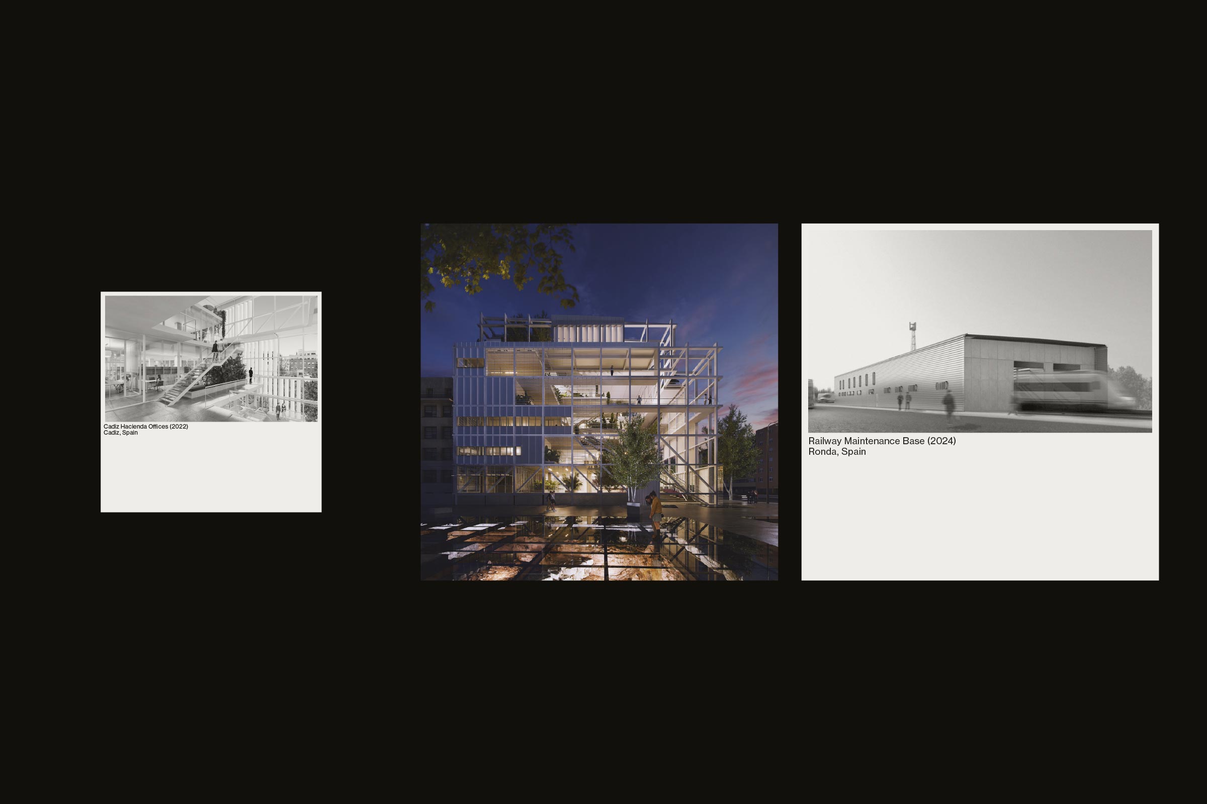
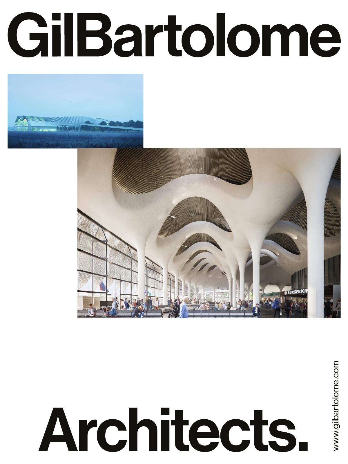
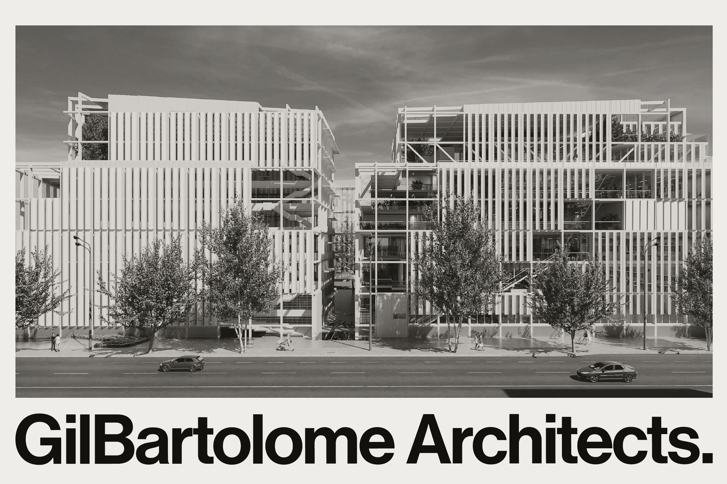
GilBartolome Architects is an international architecture office based in Madrid devoted to the design of expressive and innovative buildings following the highest technical and professional standards.
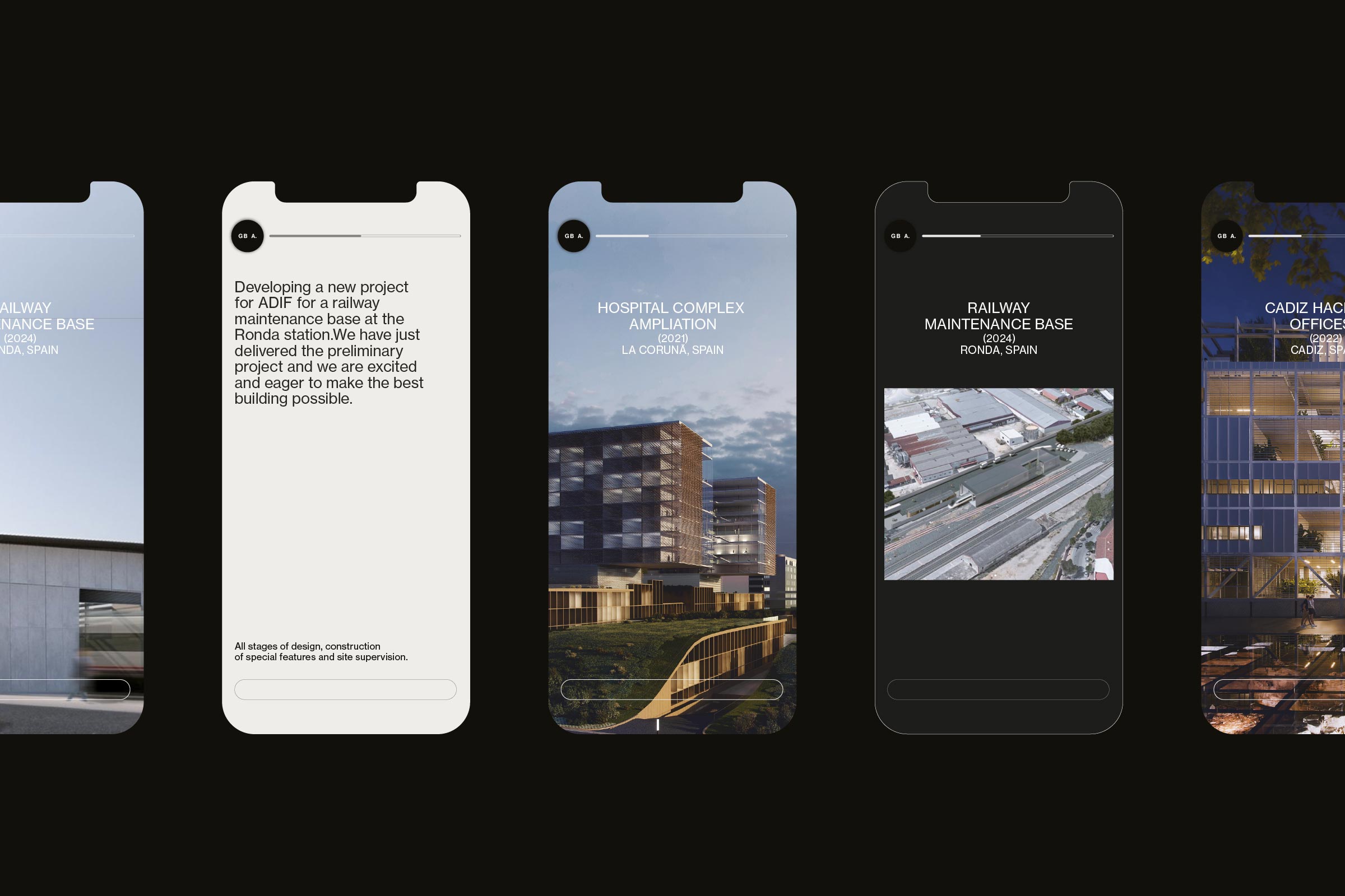
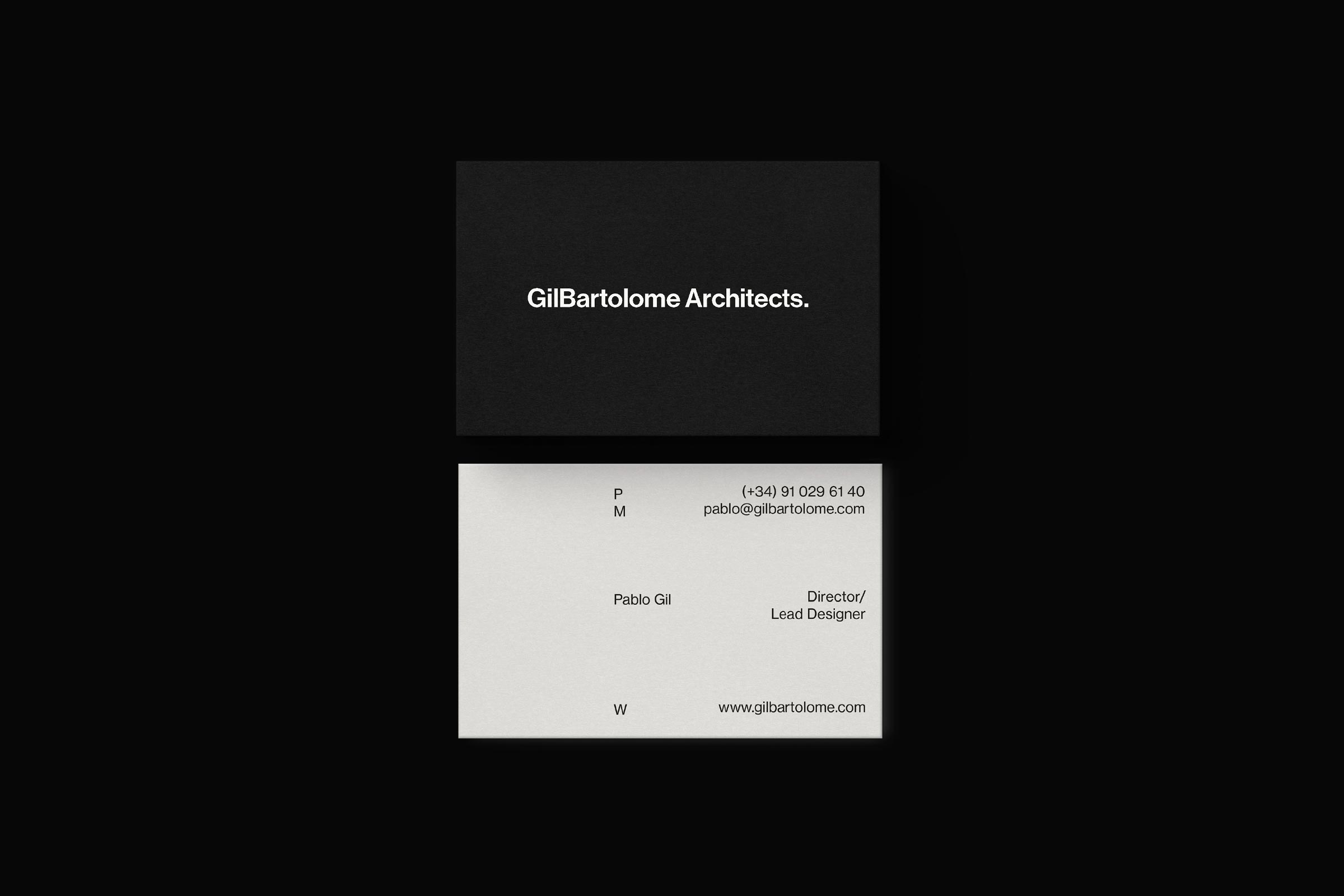
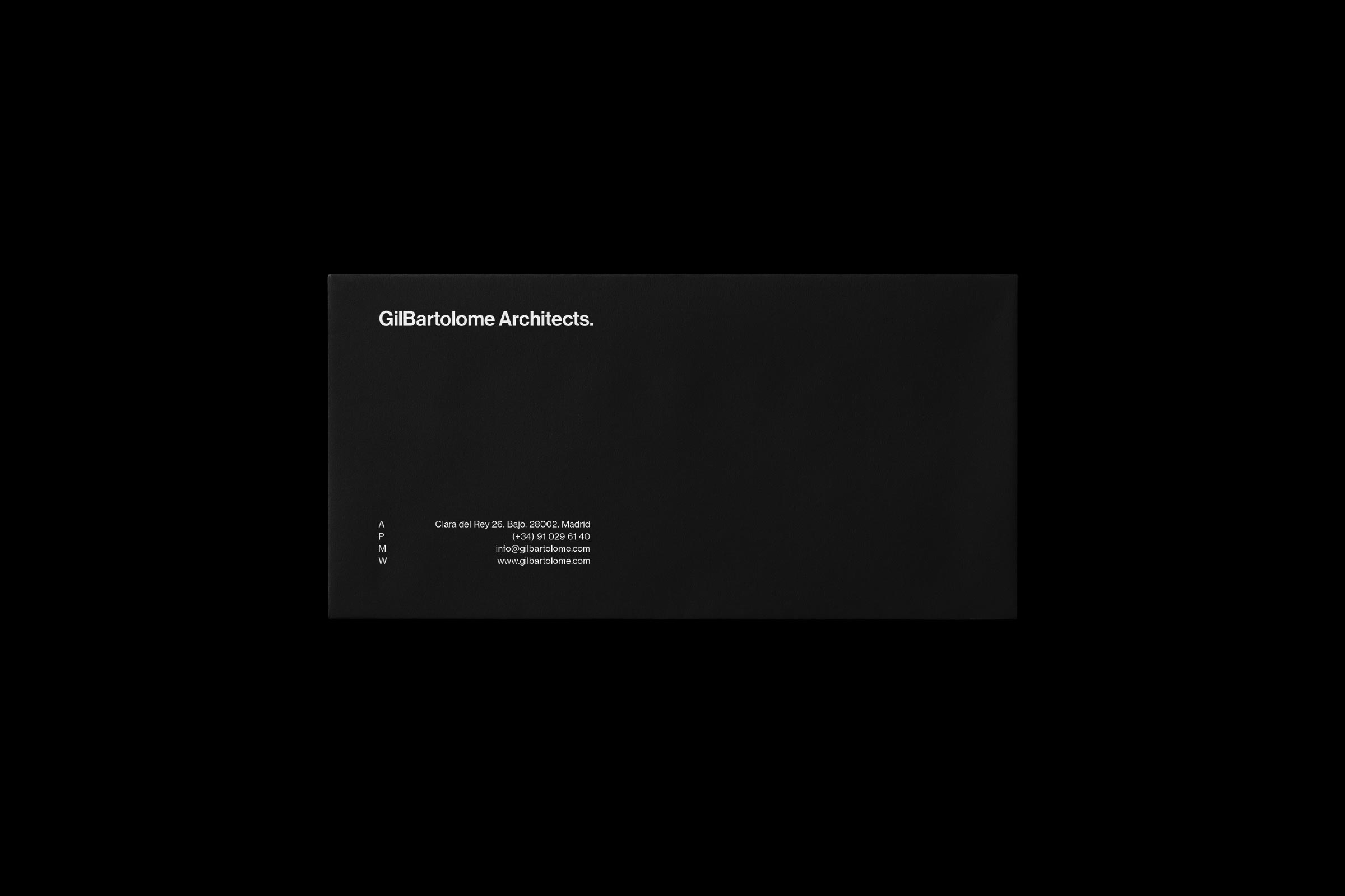
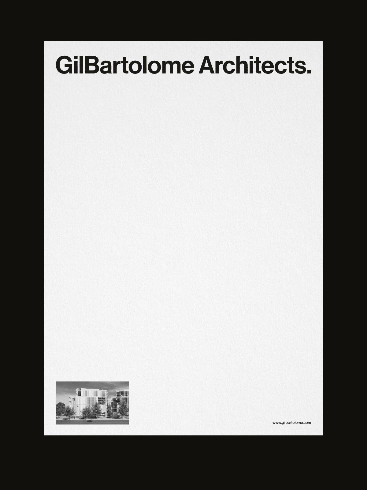
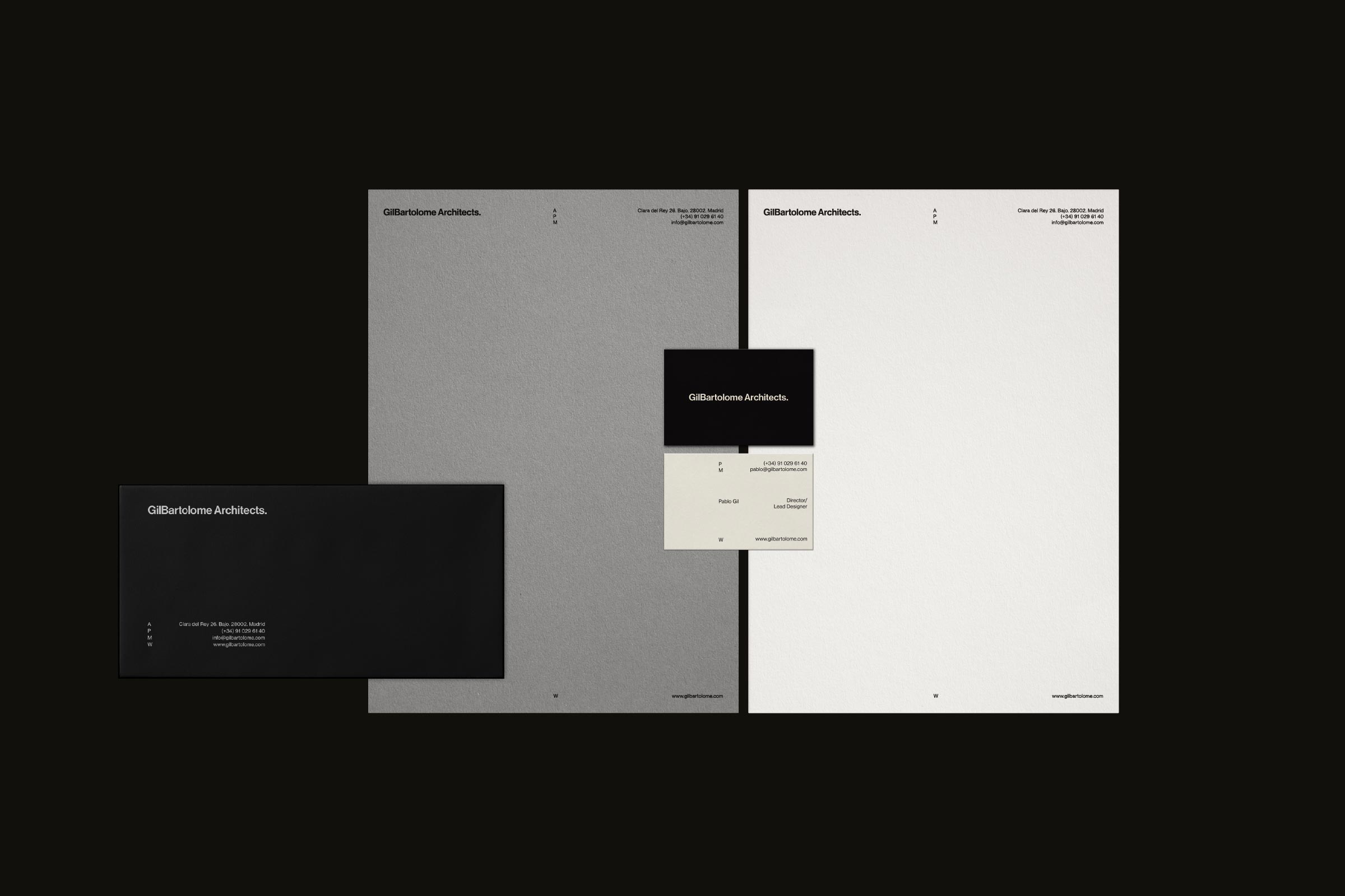
Crafting a new visual identity for Gilbartolome meant translating their core principles into a design system that balances precision, simplicity and impact. Inspired by the foundational idea of the “dot” as the origin of every project, we developed a visual language that reflects their commitment to balance and deliberate artistry.
The “dot” becomes a central motif, shaping geometric patterns, modular grids and layouts that convey stability and order. This meticulous approach guarantees their identity resonates as much visually as it does conceptually. The palette — neutral tones like beige, black, white and gray — was chosen to reflect the studio’s seriousness and sophistication, while generous use of white space adds clarity and refinement. The use of accents of color in photography bring subtle warmth without compromising the overall sobriety and professionalism of the design.
Our approach was guided by the clean, rational and functional principals of the Swiss Style design. The result is a visual identity that amplifies the brand’s credibility and excellence while staying true to the timeless elegance of their work.