




Cunha del Solar
Creative Direction
Bruno Soares
Eduardo Rodrigues
Design
Eduardo Rodrigues
João Randmer
Photography
Francisco Ascensão
Motion Graphics
João Randmer
Services
Creative Direction
Visual Identity
Client
Cunha del Solar
Every work of architecture begins with proportion. A relationship between what is drawn on paper and the space that will one day be inhabited. Cunha del Solar’s identity grows from this open-ended measure: a symbol that evokes a ruler without defining a specific scale. That is precisely why it can represent them all.
Sitting between abstraction and representation, the symbol retains only what is essential to architecture: scale, precision and the idea that everything large once began small. It does not depict a house, a floor plan or any of the sector’s familiar visual conventions. Instead, it expresses a principle. A measure turned into a signature.
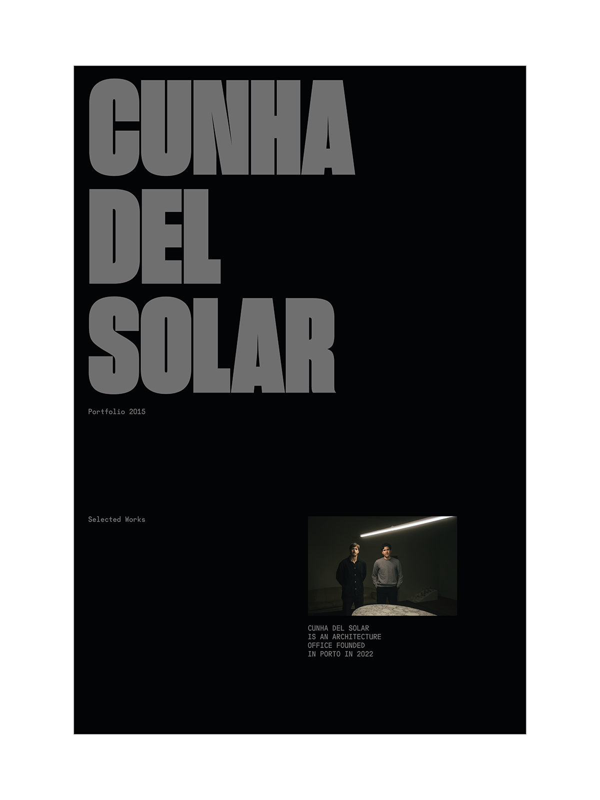
The name, in turn, speaks with confidence. Set in condensed, heavy letterforms, it stacks and fills the space with an almost physical presence. There is something of the wall and the block in the typography, giving the brand the solidity of those who build. Every element occupies its exact place, with no need for spectacle or excess.
An identity that does not need to overexplain itself, because good architecture does not either. A brand drawn to the exact scale of what it is.