

















Emiglia
Creative Direction
Bruno Soares
Eduardo Rodrigues
Design
Eduardo Rodrigues
João Randmer
Photography & Video
Eduardo Rodrigues
João Randmer
Motion Graphics
João Randmer
Illustrations
Studio Rana
Services
Creative Direction
Visual Identity
Packaging
Client
Emiglia
Some recipes are passed down through generations. Some names are too.
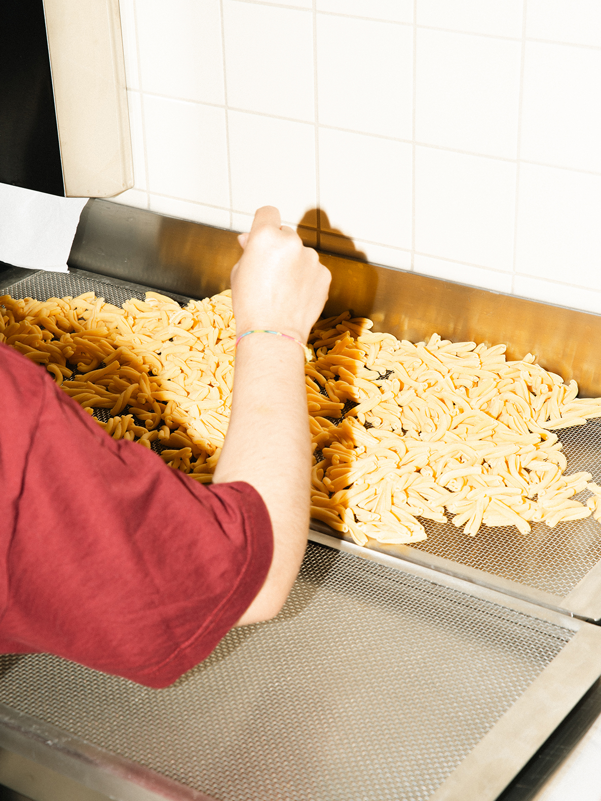
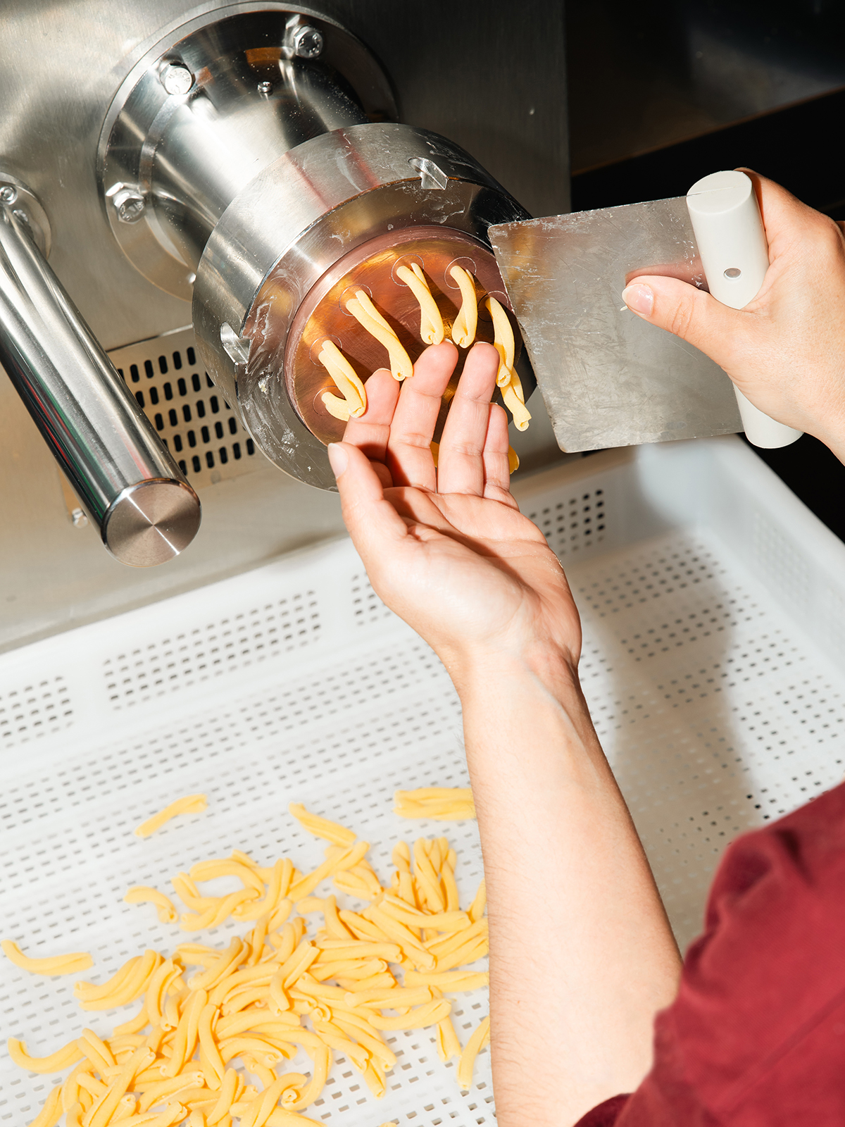
Emiglia was born from the place where memory meets craft, giving new expression to a story shaped by fresh pasta, time and the pleasure of sharing food.
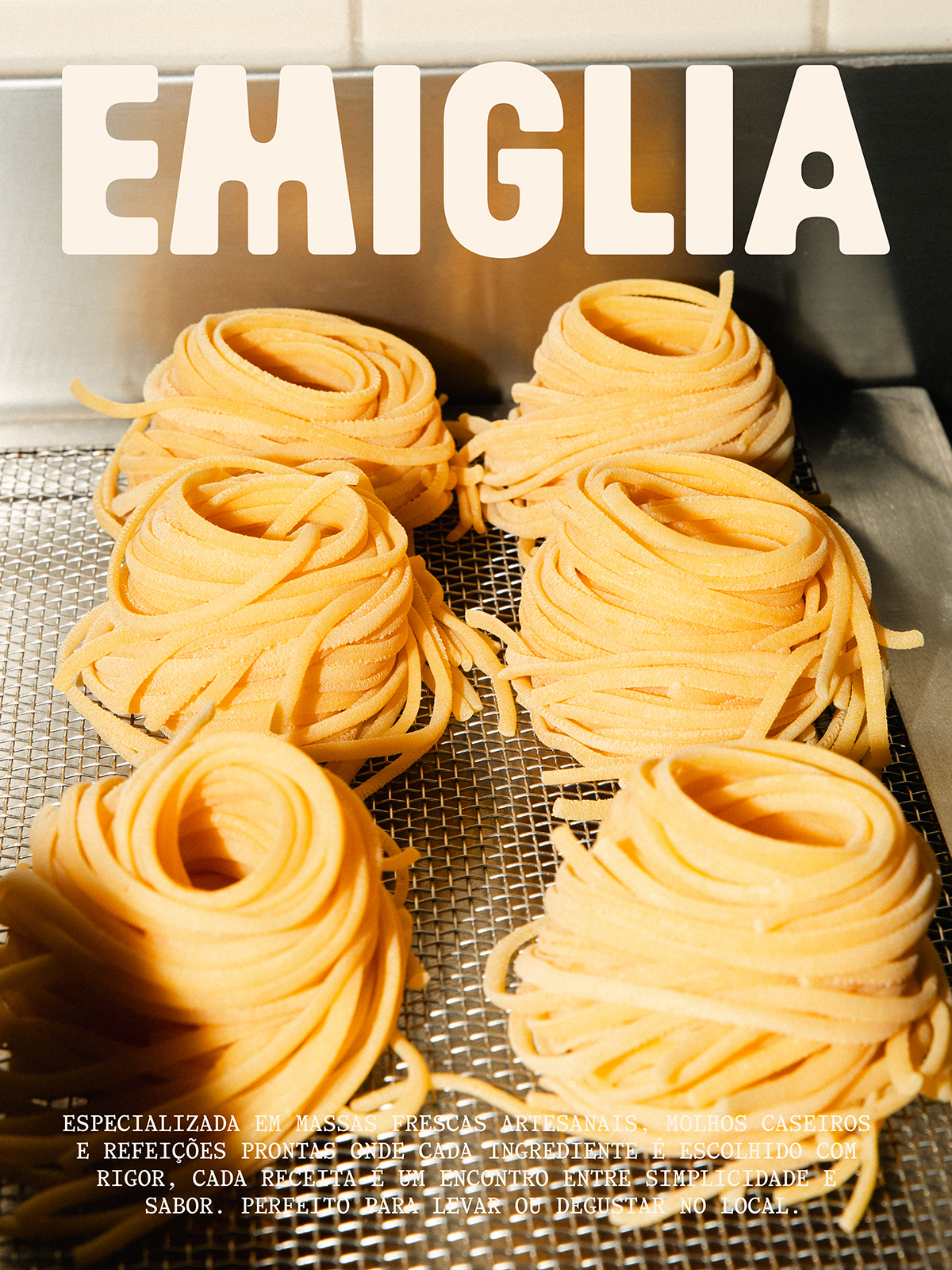
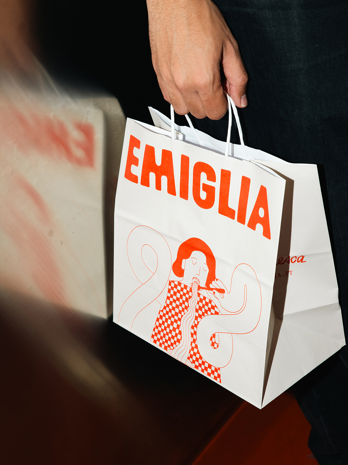
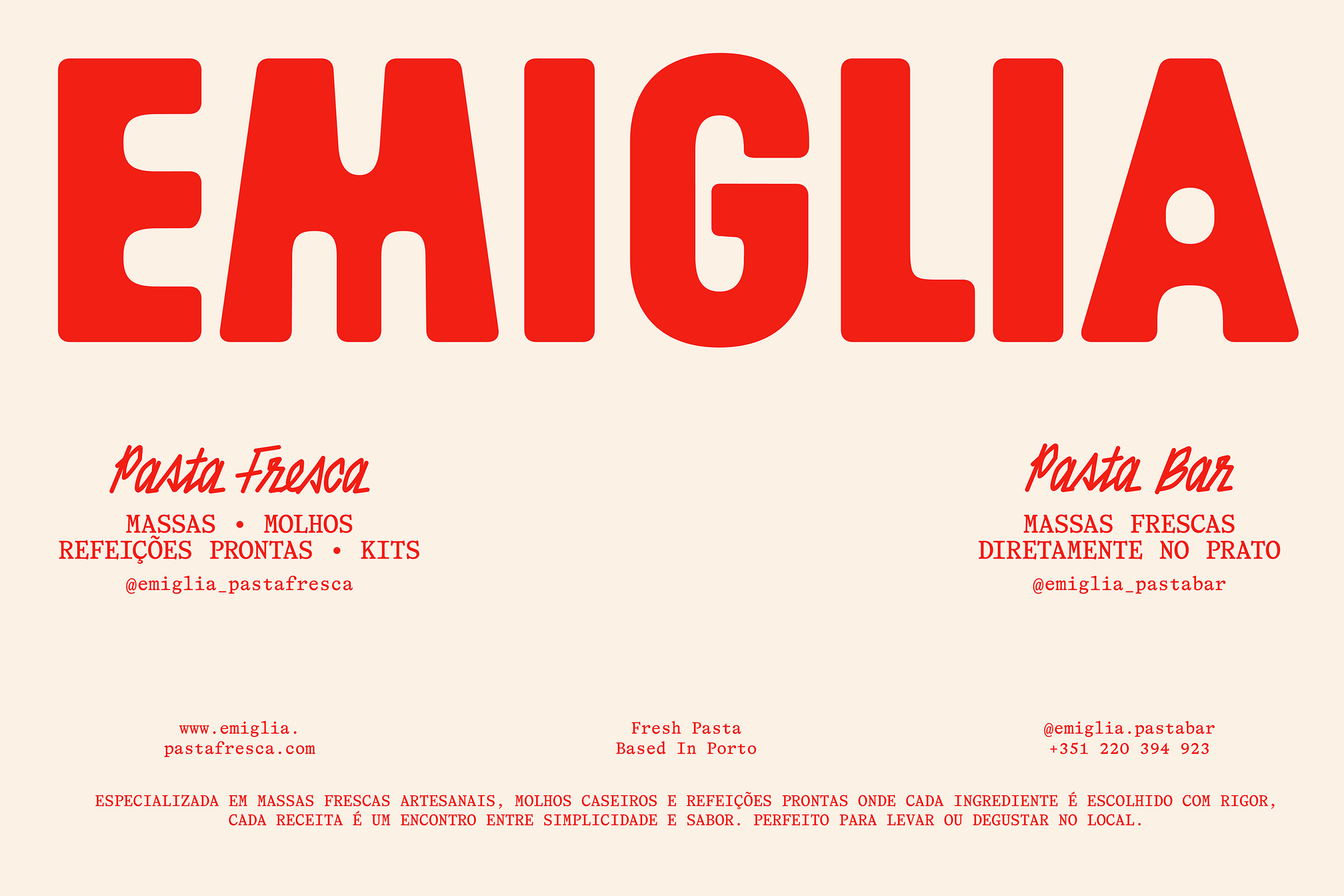
This rebrand creates a unified identity across both the factory and the pasta bar, allowing the brand to evolve while preserving its human character. The existing illustrations remain an integral part of the system, while a new typographic approach introduces a stronger sense of personality, sitting naturally alongside them and bringing together tradition and contemporary expression with greater confidence.
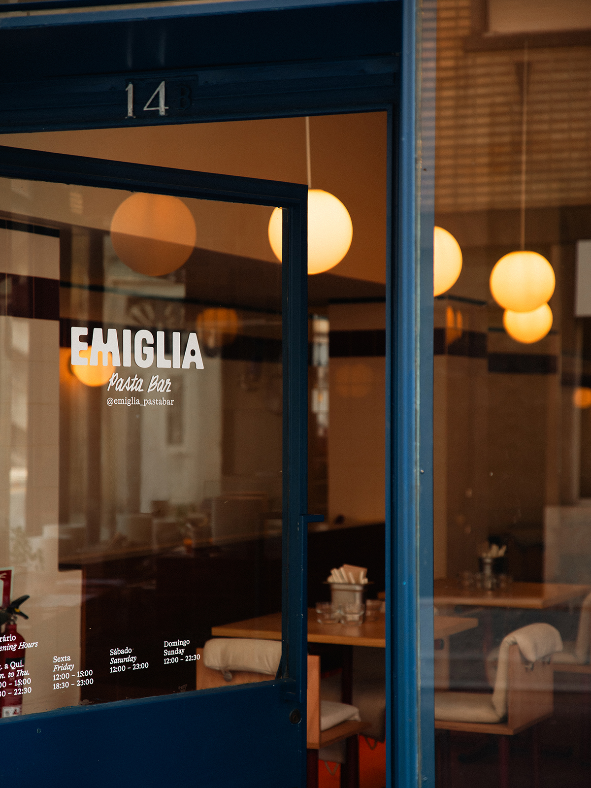
The logotype reflects this evolution through a warmer, more distinctive design, carrying forward a story that continues to grow with the brand and adapt to new contexts.
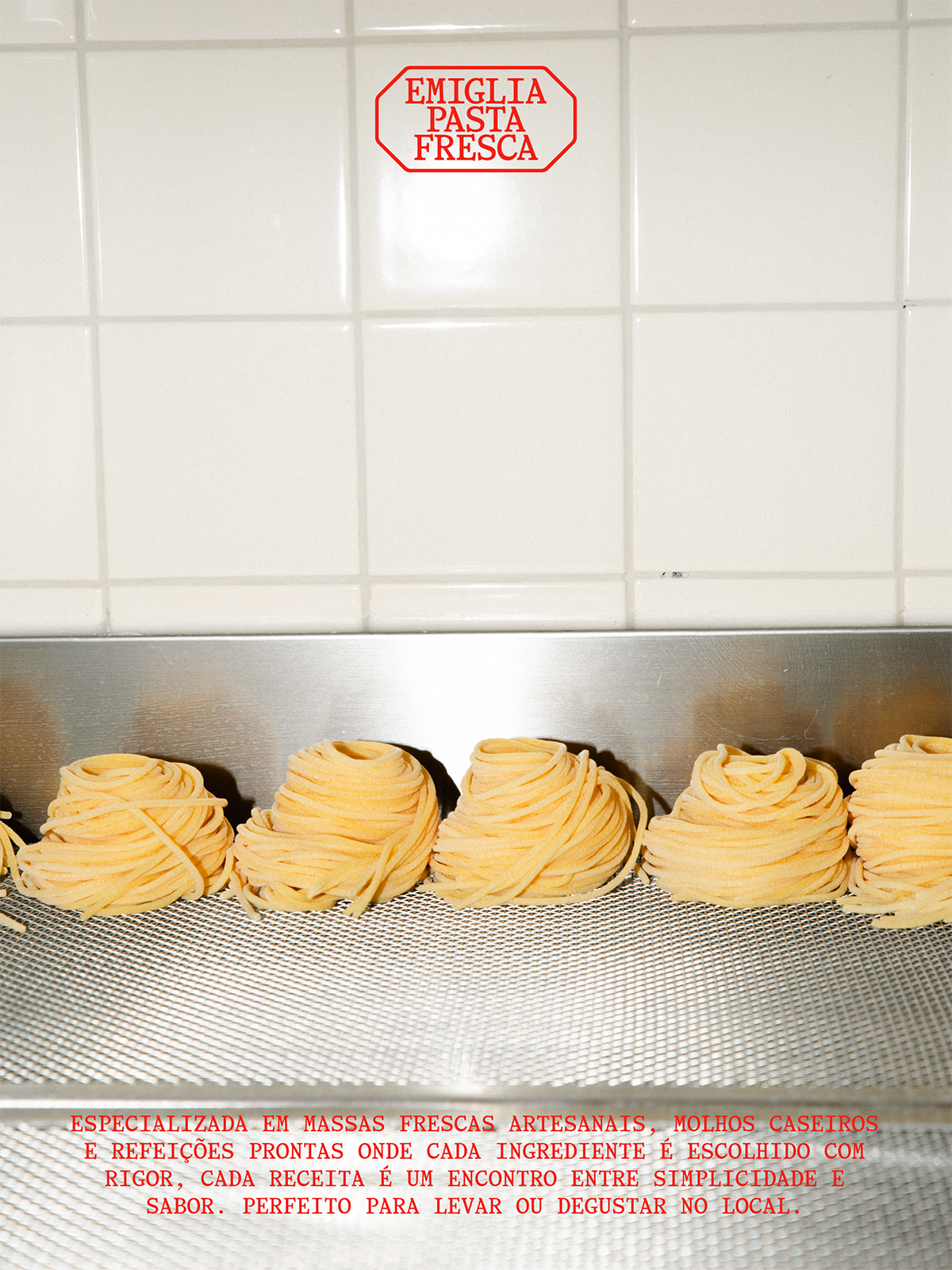
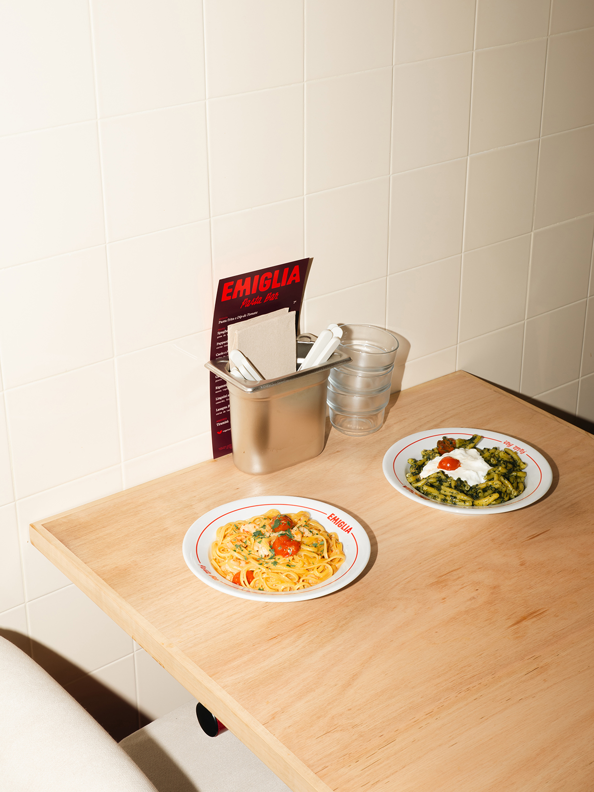
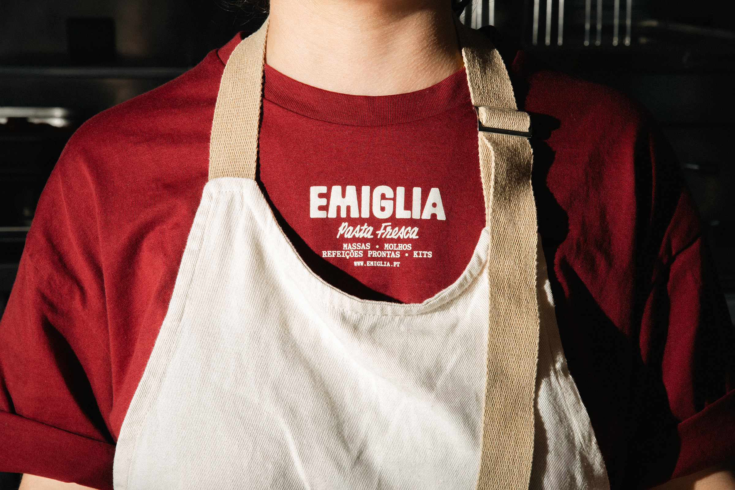
From packaging to signage, from menus to everyday communication, every element contributes to a cohesive, approachable and recognisable identity. Craftsmanship is no longer treated as nostalgia, but as a deliberate way of making things. An identity that preserves what matters while finding a new way to express it.